Attention to Retail
A Sports Fashion Brand Web Site Gets an Overhaul
Problems and Goals Statement
Pow is a lifestyle brand that caters to those who love board sports like skateboarding, snowboarding, and surfing. They wanted to find a way to reach a young adult audience and increase consumer engagement with their online presence. The goal was to create an inviting interface that suited their brand, increased online sales, and helped them to tap into the markets of major cities. My role was to oversee the branding and functionality of the interface. This included creating mood boards, iconography, color palettes, typography, brand research, design system development, and interactive prototyping.
Problems:
- Struggling to reach a young adult audience: Traditional marketing methods miss the mark with today’s youth.
- Difficulty competing with more prominent brands: Major apparel companies often have the resources to dominate marketing and distribution channels, making it challenging for smaller brands to gain visibility.
- Restrictive market reach: Geographic limitations hinder their ability to tap into major city markets, missing out on a significant portion of the skateboarding community.
Goals:
- Embrace dynamic storytelling: Ignite imaginations and spark meaningful connections by weaving captivating stories into our skate/sport clothing, empowering individuals to discover and share their unique narratives through the language of movement and self-expression.
- Ease user confusion: Craft clear, intuitive designs that communicate instantly and effortlessly, guiding users through their experience with joy and minimal confusion.
- Encourage inclusivity: Cultivate a diverse and inclusive brand identity that celebrates the unique spirit of skate/sport culture, amplifying the voices of marginalized communities and fostering a culture of respect, collaboration, and creativity.
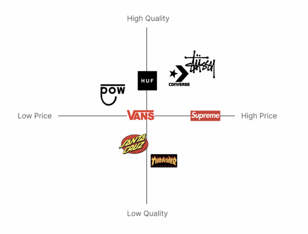
Perceptual Map
While lower prices were a potential advantage, Pow needed much stronger marketing to unlock its full potential. The market has always been crowded, and pricing alone wouldn’t be able to separate them from the rest. They needed to amplify their story, values, and unique offerings to connect with young skaters, build brand loyalty, and reach beyond price-driven choices.
Users and Audience
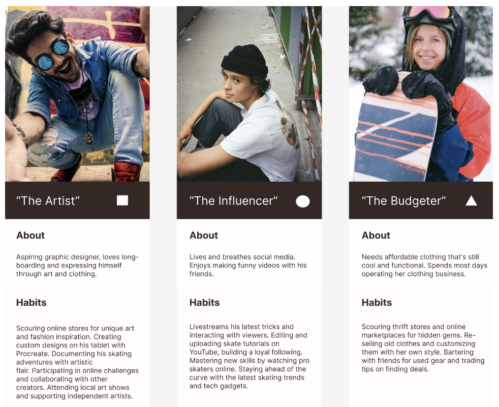
The target audience for Pow prioritizes self-expression, community, and affordability. They are budget-conscious and value unique style, authenticity, and human connection. They’re frustrated by generic clothing, high prices, and lack of inclusivity.
Personas
Design Approach/Solution
For this project, I took a two-pronged approach: immersive experience and community inclusivity. The main guiding principles I focused on:
- Authenticity: Reflecting the raw energy and street culture essence of skateboarding through bold visuals, dynamic elements, and user-generated content.
- Inclusivity: Creating an inviting environment for all individuals and subcultures within the community.
- Seamless Functionality: Offering intuitive navigation and user-friendly product browsing
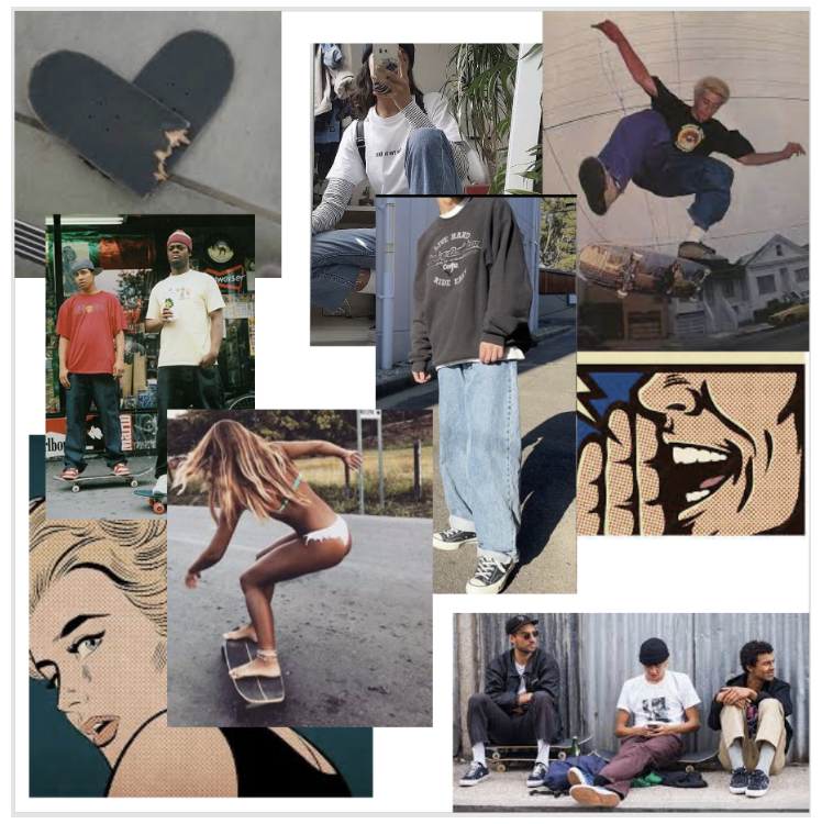
Mood Boards
The mood board served as a visual blueprint for brand identity, showcasing imagery like:
- Gritty urban landscapes: Reflecting the raw energy of skate culture.
- Diverse skaters in action: Celebrating inclusivity and authenticity.
- Product photography: Showcasing clothing features and functionality.
Achieving the Goals
These design choices aim for:
- Personalized Experience: Wishlists and customizable profiles empower self-expression, letting users build an online identity that reflects their personal spirit.
- Intuitive Navigation: An intuitive menu and dynamic search bar assist users in locating the gear they are looking for, eliminating frustrating hunts through complex categories.
- Minimalist interface: Streamlined layout and intuitive navigation prioritize a smooth browsing experience, avoiding overwhelming clutter.
- Engaging Story: Weave the brand’s values and story into the design, fostering deeper connections with customers.
Design and Branding Elements
Logo Design and Color
I began creating logo designs that I felt fit the essence of the company. I started by making twenty quick concept sketches.
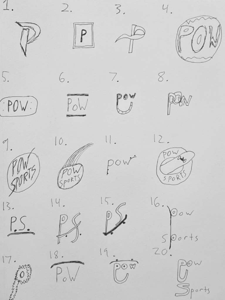
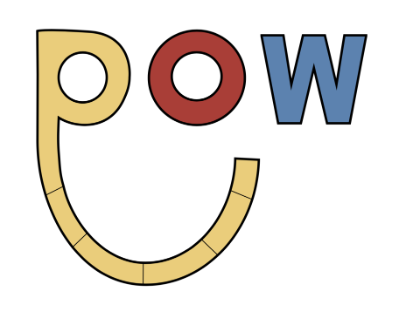
One of my main goals was the modernization of the logo. The original concept I had decided on was essentially a half-pipe that fit into a smiley face within the type.
Logo 1:
Although I liked my original color palette/concept, the first draft of the logo felt very childish and outdated.
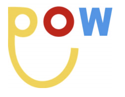
Logo 2:
The second draft felt slightly more modern but was very far from what I had envisioned to fit within the interface. It had no edge to it and didn’t fit the identity of the brand.
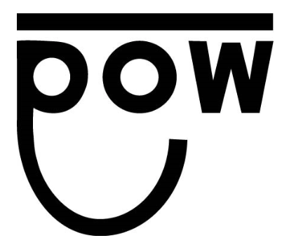
Logo 3:
After researching other logos and color trends I decided I would black out the logo. I later decided I would draw closer to the idea of fitting a smiley face into the design for cultural appeal.
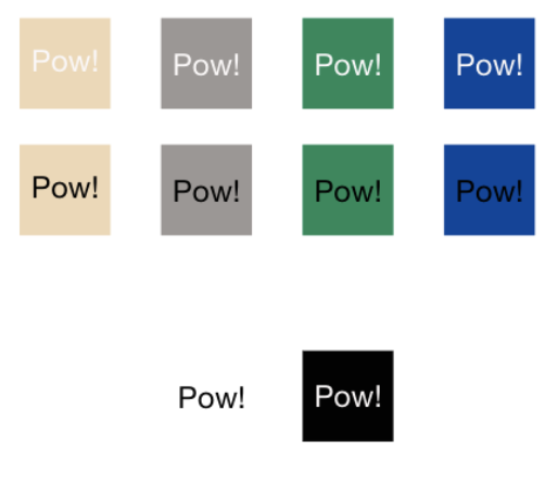
Color Palettes
I selected a light grey and tan along a few of my original brighter colors and lowered the saturation to give it a rougher appearance. I then added text to experiment with how it would pair with the company name.
Typography
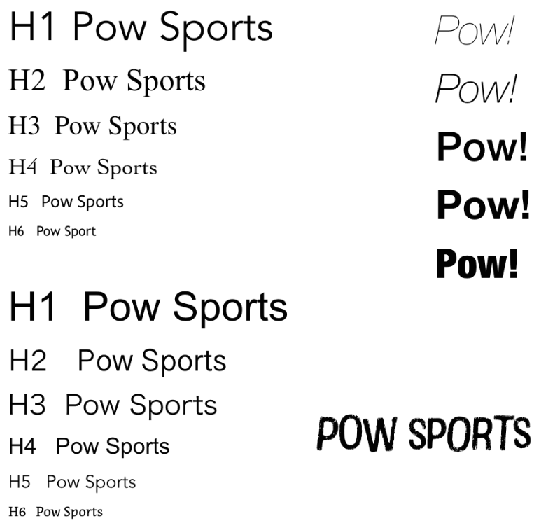
My main focus for the type was to not distract from the main elements of the interface. I wanted something simple and easy to read in any size. I decided on Arial and Avenir for the main components and Cotton for a few product elements.
Development
Wireframing
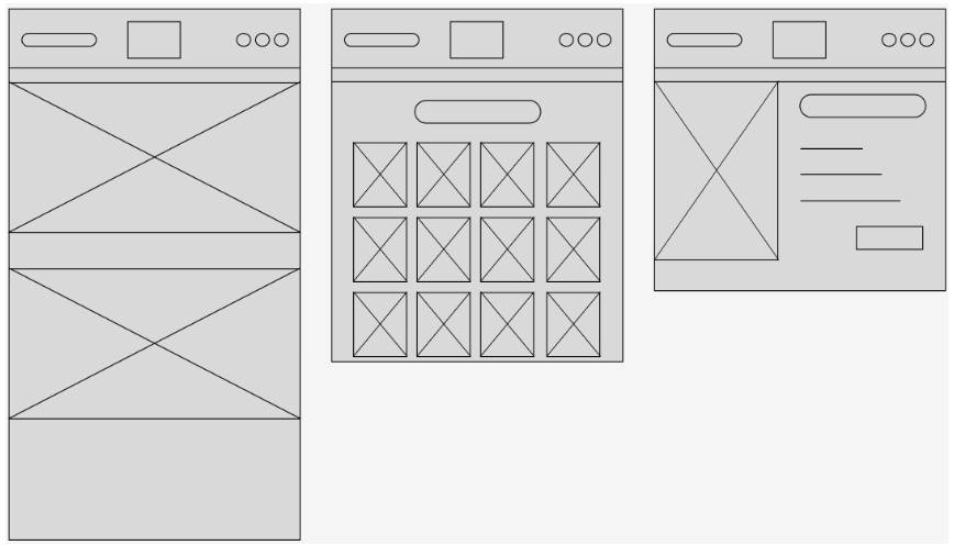
Wireframes served as structural blueprints. The focus was on clear hierarchy, visual hierarchy, and seamless user journeys.
Finale Designs
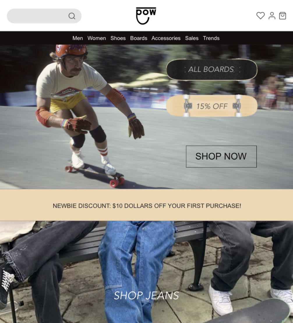
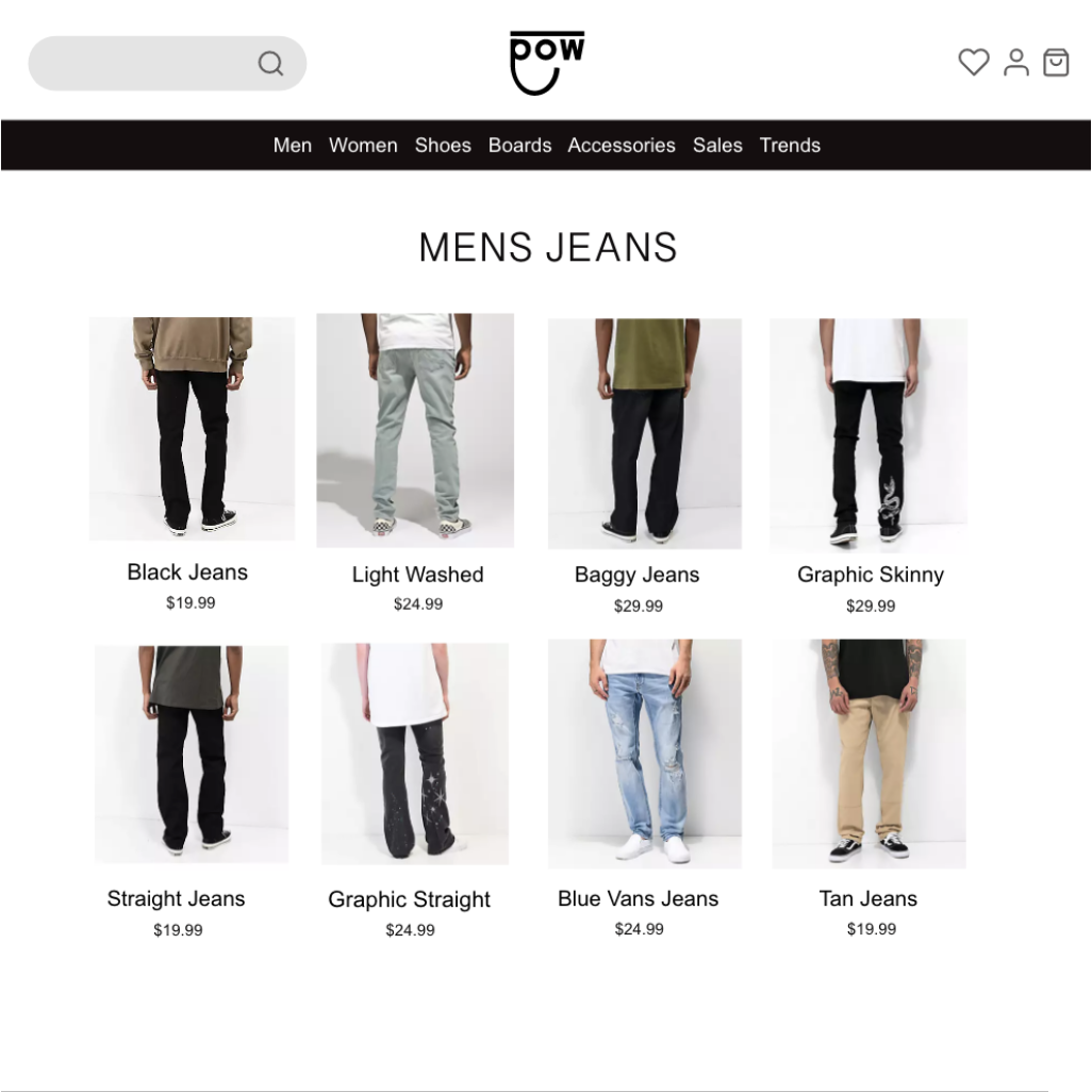
The final design embodies raw energy and street culture while appealing to the three original interface goals for the brand.
Embrace Dynamic Storytelling
- The product design incorporates graphics, patterns, or text that tell stories or evoke emotions related to skating and self-expression.
- Using social media to share stories about the brand, the athletes it supports, and the skating community.
Ease User Confusion
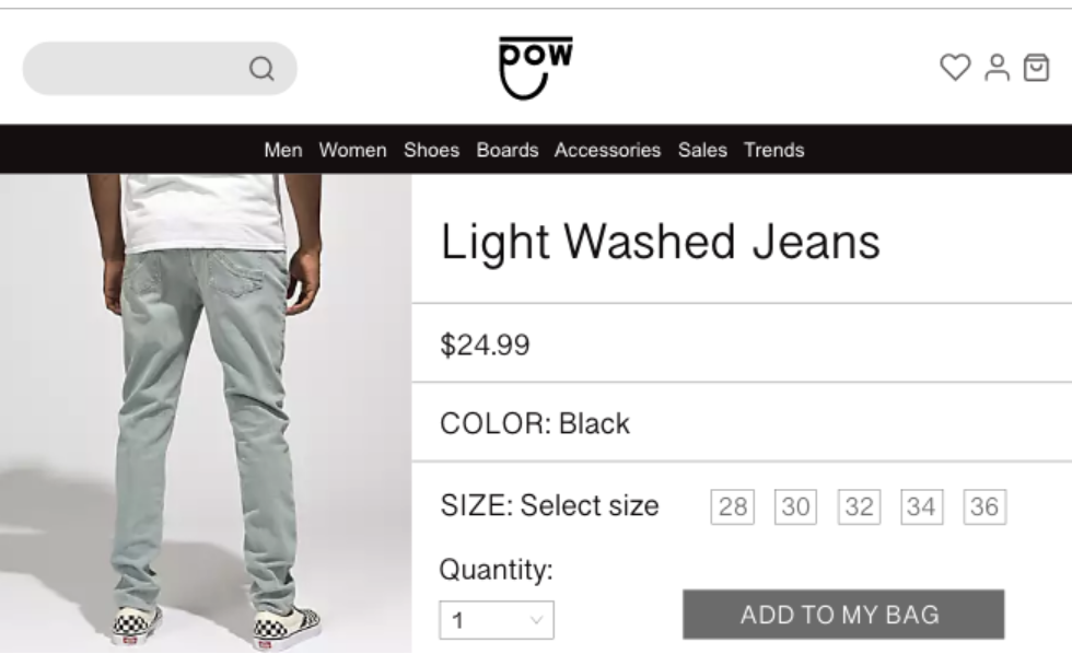
- Simple and intuitive navigation allows users to find what they’re looking for, whether it’s specific products, information about the brand, or customer service.
- Conducting clear and concise product information by using descriptive language, high-quality images, and helpful sizing guides.
Encourage Inclusivity
- Diverse product offerings offer a variety of styles, sizes, and fits to cater to a wide range of body types and preferences.
- Marketing diverse representations of models and athletes in marketing materials and campaigns.
Key Insights
- Young adult skaters crave authenticity, inclusivity, and a sense of belonging. The website is not just a sales platform but a digital platform for expression, connection, and inspiration.
- Balancing product discovery with visual communication is crucial. Seamless shopping experiences are essential, but equally important are features that tell a story and celebrate shared values.
Next Steps
- I plan to conduct usability testing through user interviews to help understand pain points in product navigation and ensure a smooth and engaging user experience before launching this website.
- I aim to incorporate content creation and drive community-building efforts to attract the targeted audience early on. I will partner with skate influencers and host product giveaways and online challenges.
- I’ll look to incorporate analytics and user feedback to fuel continuous improvement and optimization. Real-time analytics will track user behavior to identify areas for improvement. Online surveys can gather feedback on product features and website design.
