One Bite at a Time
In-Depth Recipe App Development
INTRODUCTION
Overview
Quisine wanted to create a cooking app curated for a specific audience. Stipulations for this audience were to design an interface prioritizing quality recipes with time sensitivity. The answer was to do a deep dive into a user persona and design solutions to help the user in their pursuit to save time on meal preparation. Timers, filters, and meal plans were added to gratify the user’s experience. I had the opportunity to lead the development process. This process started with user research, function prioritization, and branding ideation. This information allowed me to move to exploratory designs, user testing, surveying, and user feedback.
BACKGROUND
Business Goals & User Needs
Goals:
- Become the go-to resource for busy individuals seeking quick and delicious meals.
- Increase user engagement through a user-friendly interface and diverse recipe options.
- Foster a loyal community by offering valuable content and building trust.
Needs:
- Save precious time by finding recipes that fit their tight schedules.
- Discover easy-to-follow instructions for foolproof meals.
- Utilize readily available ingredients to avoid unnecessary grocery trips.
- Explore a variety of cuisines while maintaining a focus on speed.
User Pain Points
- Limited Time: Users struggle to find time for elaborate meal prep and cooking due to busy schedules.
- Decision Fatigue: Feeling overwhelmed by endless recipe searches and unsure which ones are truly quick.
- Confusing Ingredients: Recipes often call for hard-to-find ingredients, requiring extra grocery trips.
- Inconsistent Results: Following recipes that take longer than advertised or end up not tasting good.
- Healthy Concerns: Difficulty finding quick meals that are also healthy and nutritious.
- Dietary Restrictions: Limited options for users with allergies, vegetarians, vegans, or specific dietary needs.
User Needs Statements
- “I need a recipe app that shows me meals I can make in 30 minutes or less, so I can spend less time cooking and more time on my business.”
- “I’m tired of spending hours searching for recipes online. I need an app that helps me quickly find easy-to-follow recipes.”
USER RESEARCH
User Survey
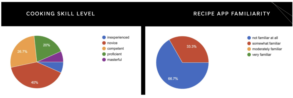
I conducted a user survey of about fifteen people. The survey contained eight in-depth multiple-choice questions regarding demographics, cooking, and icon/layout preferences. Overall, the survey provided great insights into these topics and was a huge help for further development.

User Personas

DESIGN & IDEATION
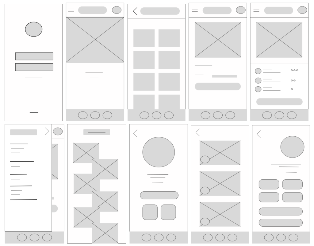
Low-fidelity Wireframes
Problem statements
- The lack of clear time filters makes it difficult to identify recipes that can be prepared within a specific timeframe. Users (especially novice cooks) struggle to gauge recipe cooking times accurately, leading to frustration and unrealistic expectations.
- Recipes rarely consider multitasking opportunities. Users with limited time cannot efficiently utilize cooking downtime for other tasks due to unclear recipe structure.
- Existing recipe apps prioritize recipe browsing over speed. Users get lost in recipe exploration, wasting valuable time before finding meals that truly fit their tight schedules.
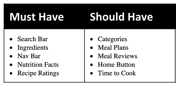
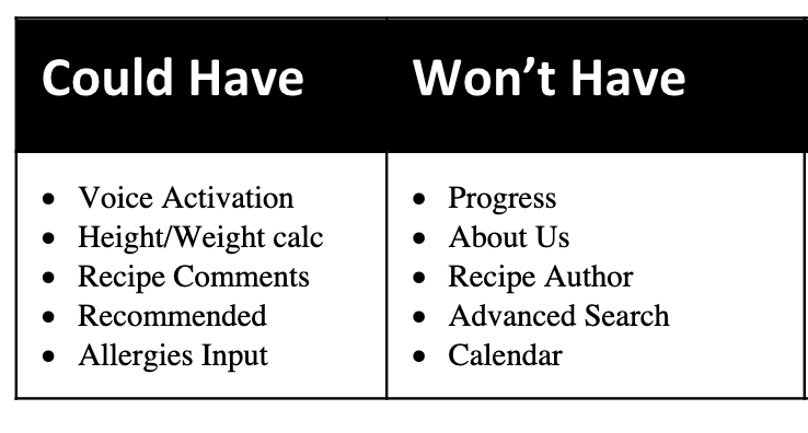
MoSCoW Analysis
DESIGN REFINEMENT
Usability Testing (Round 1)
Testing Script
Welcome to our paper prototype test for the Quisine cooking app. We are thrilled to have you participate in this important part of our design process. Your insights and feedback are important to us as we work to create a user-friendly and effective application. This paper prototype test is a crucial step in ensuring that we understand and meet your needs.
Our paper prototype test gathers user feedback and insights to inform the design and development of our mobile application. We are working hard to design an interface that assists users in planning and preparing their meals in a timely manner. Any insights gained from this study will be considered for our next development. Please understand that any errors can be attributed to the functionality of the design and not your decision making.
Please note that this test will be video recorded to review and gain a better overall understanding of how users interact with our application. The video recording will only include our hands as we walk through the design process. If you are comfortable with this, please sign the consent form below.
Brief Description
Quisine is a user-friendly mobile application designed to simplify meal planning for individuals with busy lifestyles. Whether you’re a working professional, a busy parent, or a student on the go, Quisine helps you prepare delicious and nutritious meals within tight time constraints.
Task List
- You’ve just gotten in from a long day of meetings and the game starts in 30 minutes. You want something more than a frozen dinner and you’re tired of pizza and sandwiches. You’ve got the leftovers of a whole chicken from the deli and a box of pasta calling too. Find a recipe that uses these ingredients that can be prepared in less than 30 minutes.
- You’ve been at Zoom meetings all morning, your last one ran late, and the next one starts in 30 minutes. One of your “go to’s” is skillet hamburger, but you want to add gravy to it, and you don’t know how to do this. See if you can find a recipe for hamburger gravy that can be prepared in less than 20 minutes (after all, you need time to eat before the meeting starts).
- You don’t mind sandwiches during the week (because they’re generally quick and easy), but you want to up your game and do something more interesting next week. Find several sandwich recipes that sound interesting, and create a shopping list of the ingredients you’ll need when you go to the store later this week
Paper Prototypes


Prototypes Being Tested
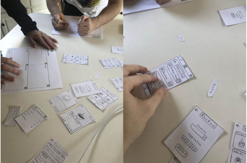
Five Changes Based on User Feedback
- PROBLEM: There is no signifier that anything has been added when adding items to the ingredients list.
- SOLUTION: Make a numbered bubble over the ingredients button to show that something has been added.
- PROBLEM: It was unclear whether the user was searching for a recipe or for an ingredient.
- SOLUTION: Create a separate search bar incorporated within the ingredients tab.
- PROBLEM: “cook” button does not apply to all recipes (e.g. sandwiches) and can be misleading for some users.
- SOLUTION: Create a button that is more inclusive such as “prepare” or “create”
- PROBLEM: The expiration input when adding ingredients wastes time and will likely be unknown to the user.
- SOLUTION: Make this function optional or remove it altogether.
- PROBLEM: Grouping ingredients to create a list of relevant meals can be confusing if you are not used to the interface
- SOLUTION: Create more explicit header navigation through buttons or a help button for novice users.
HIGH-FIDELITY PROTOTYPING
Visual Design & Branding
Logo
The logo should be simple, memorable, and visually appealing. The green and black combination should feel fresh, modern, and trustworthy, reflecting the app’s focus on healthy and quick meals. The logo combines the ideas of speed and freshness associated with quick and healthy meals through a green and black color scheme. Green represents freshness, health, and growth. Whereas black represents efficiency, speed, and sophistication.

Home Page / Starting Elements
The “Quick Meals” and “Meal of the Day” sections on the home page streamline the user experience for finding fast and healthy recipes. Users see time-saving options and a curated suggestion, reducing decision fatigue. Highlighted cook times and help users quickly identify suitable recipes. The “Meal of the Day” section provides all the details for users to see the fastest and highest reviewed meal for that day.

ITERATION AND REFINEMENT
Design Iteration
After a few quick tests I decided I wanted to make a few changes to my original first two iterations. I first cleaned up the home page and made it more visually appealing.
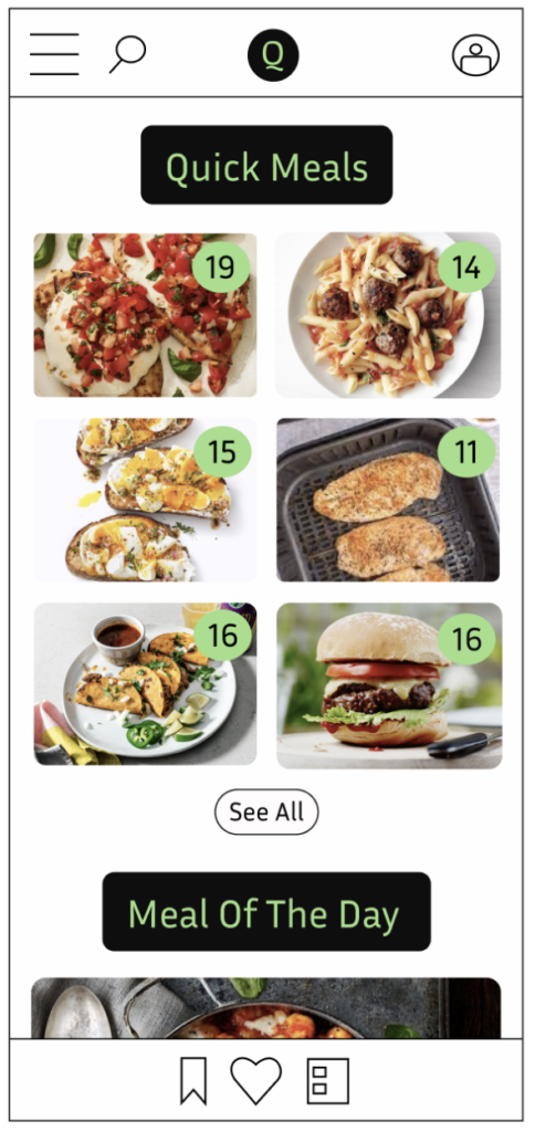
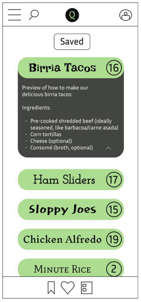
Second, I realized that if the app is meant for speed, then an overly descriptive bio under each meal would not be a wise design choice. This led me to add only the ingredients to let the user get straight to the desired information and make quick decisions based on what they have. I also realized that I needed a like and save button under each meal.

In the saved section I once again let the users quickly see the cooking time as well as ingredients to ease any user confusion and help save time.
Final Prototypes


IMPACT AND CONCLUSION
Expected Outcomes
- Increased User Engagement: Focus on speed and convenience keeps users coming back for quick and reliable recipes.
- Enhanced User Retention: Easy-to-follow instructions and satisfactory results lead to user satisfaction and continued app usage.
- Improved Brand Reputation: A focus on healthy, flavorful “fast food” disrupts negative connotations and positions the app as a valuable resource.
Key Takeaways
- The users value speed and efficiency above all else.
- Clear visuals and concise instructions are crucial for users of all experience levels.
- It’s important to focus on the goal more than the content.
What I Might Do Differently
- Prioritize user testing sooner than later. Gather feedback on the app’s usability and design throughout development.
- Explore gamification elements. Consider badges, rewards, or leaderboards for recipe completion or healthy meal streaks to boost user motivation.
- Develop video tutorials. Offer short, visually engaging step-by-step video guides alongside written instructions for a multi-sensory learning experience.
- Partner with food bloggers or chefs. Collaborate with popular food personalities to create exclusive content and increase brand awareness.
